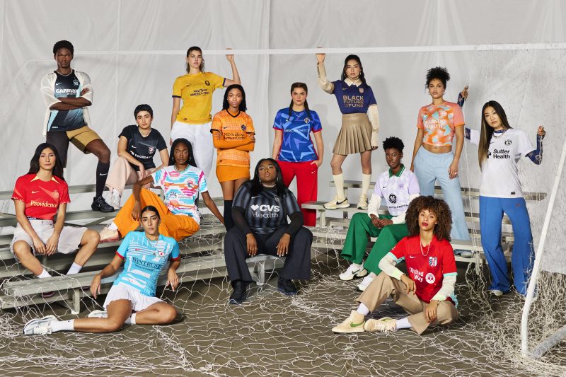
The NWSL has more teams than ever, which makes for more kit designs than ever.
On Tuesday, Nike unveiled new uniforms for all 14 teams ahead of the 2024 season kickoff on March 16. It’s the first time in league history that each team got a fresh design.
Each club has a primary kit that celebrates is own identity with ties to the team history and city’s culture and a secondary jersey ‘inspired by the strength of the collective.’
There is lots of color among the NWSL uniforms, including splashes of blue, purple, red, orange and teal. But some uniforms rely on tried and true black and white designs.
Fans will notice there are no white shorts in the lineup. Nike said this came directly from feedback from the players that white shorts were a distraction on the pitch. This isn’t the first time white has been problematic for sports uniforms. Last year, Wimbledon relaxed its dress code so that women could wear dark-colored underwear after complaints that the traditional all-white look was problematic with periods.
Here is our ranking of the NWSL primary kits, and if we feel really strongly one way or the other about the secondary ones, you’ll know.
Which NWSL Nike kit was the best? Which ones fell flat?
1. Orlando Pride
The Orlando Pride got a true refresh. It makes sense and is fun and inviting. The primary kit is a whimsical nod to orange trees in the central Florida area with the orange colored base and green leaves woven in. It’s a stark departure from the old look, but the secondary kit stays true to the club’s roots with a purple look that’s a perfectly rich tone. Bravo.
2. Chicago Red Stars
This one’s a head-turner! The Chicago Red Stars are instantly recognizable in this cool kit. The bright blue has splashes of white in a thoughtful geometric design that ‘represents the patchwork of people and cultures that make up the city the club calls home.’ The red stars tie in nicely to the city’s flag.
3. Seattle Reign FC
Out with the old, in with the new. There were a few teams that had a rebrand, name change or are coming back to the NWSL this year. Seattle Reign FC, returning after some time as OL Reign, showed the rest of them how it’s done. Their primary kit is a super sleek design that embraces gold to connect with royalty. The color is tastefully placed on the arm bands and lettering against a deep navy backdrop. And that queen crest is just incredible.
4. San Diego Wave FC
This Nike kit screams beach and sunshine and that’s exactly what it’s supposed to do. San Diego Wave FC is a club that’s kind of in the middle in terms of legacy. Established in 2022, it doesn’t have a ton of history to celebrate, but isn’t a brand new team that needs to make a splash. They stayed true to their club identity while the rolling sunset graphics makes any fan want to attend a match ASAP.
5. New Jersey/New York Gotham FC
NJ/NY Gotham FC is a club that’s been ahead of the game in terms of style. They continue their impressive run with this primary kit. The speckled black and blue pattern is meant to emulate the big city skyline and the black sash represents the Hudson River. The color contrast pops well and the design is interesting and meaningful. Can’t ask for more than that.
6. Houston Dash
A good uniform fits into the city’s tradition while standing on its own. And that’s exactly what the Houston Dash’s primary kit does. The orange is a similar color to the MLB’s Houston Astros and the MLS’s Houston Dynamo FC. But the bubble star pattern and color gradient here make it interesting and distinct.
7. Angel City FC
This is how to do a black kit right. Angel City FC didn’t rely on their crest to be a pop of color against a boring backdrop. Instead, they added a tasteful gray wing design and brought a cool gravel texture to the top of the shirt as a ‘nod to the grit and determination needed on the road to success.’ And the secondary kit is an elegant shade of pink that further establishes their strong brand identity.
8. Kansas City Current
The Kansas City Current primary kit is fun if only because of the bright colors. They really committed to the red and teal while some other clubs washed their identity away in black. The design, which features three waves in different shades of red coming together, is meant to emulate the crest, but isn’t anything spectacular.
9. Utah Royals
The Utah Royals are coming back to the NWSL after leaving in 2020. Their new look maintains the original bright yellow and navy blue colors of their first run in the league. The primary kit has a subtle mountain design, which is a cool tribute to the mountains of the area. This kit’s not bad. Just kind of predictable.
10. Washington Spirit
The Washington Spirit’s primary kit is a multi-striped black and white pattern meant to evoke the architecture of the nation’s capital. And the secondary look is a light yellow bordering neon green, which supposedly hints at an aesthetic that will be further revealed at a later time. Not that every team in Washington, D.C. has to be red, white and blue with eagles on their uniforms, but there’s not a lot of storytelling here and the yellow is such a tease.
11. North Carolina Courage
Everything on the North Carolina Courage primary kit feels kind of literal. The triangle graphic represents the state’s region of Raleigh, Durham and Chapel Hill and ‘celebrates the various angles of attack the team throws at its opponents on the pitch.’ So that means Syracuse men’s basketball should have zones on their uniforms, right? There’s also a ‘Be>Seem’ slogan on the bottom, to represent the state motto, ‘to be rather than to seem,’ which feels forced for the digital age. And the pink secondary kit screams Pepto Bismol and is not fresh and fun at all.
12. Racing Louisville FC
Don’t get me wrong. Purple is a fantastic color (thus why the Orlando Pride get bonus points for their secondary kit and the Utah Jazz won our NBA City Edition jersey rankings). But Racing Louisville’s Nike kit doesn’t feel like a soccer jersey that would motivate anyone to race any harder across the pitch. It feels like a preppy sweater from ‘Mean Girls.’
13. Portland Thorns
It’s understandable if the Portland Thorns wanted a more dramatic redesign to give them a fresh start because of the many controversies surrounding the club the past few years. But the black and red was so so good. On the new primary kit, which has a bright red base, there’s some thorn details around the arm and neck that feel more ‘Passion of the Christ’ than fierce soccer team.
14. Bay FC
A team’s inaugural year is a chance to really make a splash and establish an identity. So Bay FC, who is entering its first year in the NWSL, had a tremendous opportunity. The Bay Area has so so much sports history with the San Francisco 49ers, Golden State Warriors and Oakland Roots, a USL Championship club that really embraces the community. Bay FC was clearly relying on the pop of ‘poppy’ orange here, but to simply put the crest on a plain black jersey is so disappointing!


