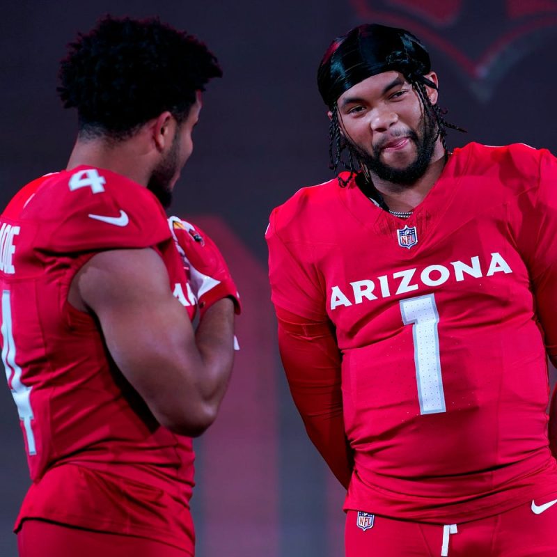
The NFL’s latest pretentious uniform reveal occurred Thursday night, the Arizona Cardinals unveiling their new look at The Van Buren – a music and art venue in downtown Phoenix.
And, admittedly, this ‘event’ might count as the apex of what projects as a dour 2023 season for the Cards. But it’s still hilarious reading a news release that seems aimed at technocrats.
To wit:
‘The Nike Vapor Field Utility Special Edition (F.U.S.E.) uniforms combine leading edge fabric technology with a precision fit. The stretch woven body fabric of Nike Vapor F.U.S.E. is made with at least 85% recycled nylon. Lightweight with superior breathability and mobility, it is also the first football uniform to meet Nike Dri-FIT standards for thermal regulation and airflow.’
Sweet. And this …
NFL Draft Hub: Latest NFL Draft mock drafts, news, live picks, grades and analysis
‘Capping off the new look for the Cardinals is a re-designed helmet. Its white shell gets a subtle silver sparkle from Large Texas Flakes. This complements a new silver facemask that replaces the previous gray one. The helmets front and rear ‘bumpers’ feature rubberized, 3-D Cardinals wordmarks in red. The Cardinals logo on each side of the helmet is now larger and updated with digital shading and a metallic sheen.’
Texas Flakes? Ironically, Texas is one of, like, five states the Cardinals haven’t been based in during their century-plus history, but I digress.
Anyhoo, the helmet logo is bigger and shinier, the facemask is radiant, and what were previously the league’s most hideous uniforms are now … merely dull? But I’ll get into that more in just a minute.
First, you’ll have to scroll through what have essentially became my annual NFL uniform power rankings (previous rank in parentheses):
32. Denver Broncos (24)
They decidedly look their best with the orange pants and jerseys tied with the throwback logo on the navy helmet – but it’s too rarely employed. And aligning the blue pants with the bloated orange stripe in conjunction with the white jersey and navy side panels last season was a truly horrid idea. (Russ?) With the Cardinals getting their makeover, many uniform aficionados would agree the Broncos should probably be next in line.
31. Washington Commanders (29)
Garbage rebrand, especially the white jerseys, and I’d love to see the new ownership purge the whole thing at the first opportunity a few years from now – may as well just reset the whole dreadful franchise. Yet I have to admit – though I’m generally not a fan of teams incorporating black alternates – that it was the best uniform option of the Commanders rollout, the D.C. flag on the shoulders a deft detail.
30. Cleveland Browns (28)
Clevelanders notwithstanding, this team’s (necessary) brown and (unnecessary) orange color combo and presentation will always be boring – yet also somehow revolting – to the rest of us. But at least the Browns have had the sense not to put that silly elf on the helmet.
29. Carolina Panthers (30)
They plan to reveal an update on draft night, but it’s not expected to amount to much more than Nike tweaking the team’s shade of blue while curtailing the shoulder stripes. Shame.
28. Tennessee Titans (26)
The sword elements are slick, particularly the helmet stripe and sheath on the pants. And the understated incorporation of the state flag into the logo has always been a nice touch. But on the whole, too many colors amid an overly busy design that just doesn’t coalesce.
27. Atlanta Falcons (19)
If only they’d revert to their original 1960s look now that the red helmets are back in play for the retros. If only they’d scrap those gradient alternates that make the eyes bleed.
26. Baltimore Ravens (27)
Maybe a team linked to Edgar Allan Poe should have a sinister mien. But this dark? Wearing black and purple also makes you look like you lost a bar fight … which doesn’t align with the Ravens’ ethos. (But at least the dijon pants remain safely locked away.)
25. Arizona Cardinals (32)
So this took three years of development? K … we happy, Kyler? The new vanilla getup is a significant step up from what they’d been relegated to the past 18 seasons. The all-white version elicits memories of the St. Louis Cardinals era, though the baseball team has always looked fresher. But the dopey phrases inside Arizona’s collars – ‘Protect the Nest’ and ‘Bird Gang’ – don’t help, and neither does the Ohio State-y veneer. Still, there was nowhere to go but up.
24. Jacksonville Jaguars (31)
We’re nearly recovered from the days of the two-toned helmet, so I’ll keep any complaints to a minimum. But a young franchise could use a touch of signature flair – light incorporation of jaguar spots? – and we’d like to see a return to the former logo, which was ditched following the 2012 season.
23. Chicago Bears (12)
Totally old school, which is fine, and the GSH tribute to founder George Halas on the shoulder had long been a nice differentiator. But Da Bears need to get out of the alternate space, and it would be perfectly fine if they never donned an orange helmet or jersey again.
22. Detroit Lions (18)
Don’t love that I always feel like I’m watching a Ford commercial as I’ve never been a fan of the brand. Didn’t love them stealing from the division rival Bears with ‘WCF’ on the left shoulder to honor late owner William Clay Ford … but especially hate the blocky ‘Lions’ on the opposite shoulder. Still, the ‘Honolulu Blue’ lion logo trumps Chicago’s humdrum ‘C.’
21. New York Jets (23)
The current versions have slowly grown on me, though the combination of the ‘Gotham Green’ helmet, ‘Spotlight White’ jersey and ‘Stealth Black’ pants has to go. And what they really need to get the Aaron Rodgers era off the runway in flying fashion is to reinstitute their 1980s look as a throwback.
20. Los Angeles Rams (25)
Maybe winning a Super Bowl softens the blow of scrapping classic tradition … but I still can’t unhear Hall of Fame RB Eric Dickerson saying the new helmet’s ram horn ‘looks like two bananas.’ The shiny gradient numbers on the blue jerseys also need to go, though adding white roadies to the palette – they were exclusively ‘Bone’ during the 2020 relaunch – helped.
19. New England Patriots (22)
Not that the ‘Flying Elvis’ era was ever resplendent – from a wardrobe perspective, of course – but the Pats were especially drab post-Brady. Thankfully, the ‘Pat Patriot’ throwbacks made a triumphant return in 2022, as did an appearance from the silver pants.
18. Houston Texans (20)
As they’ve tried to be in so many ways in recent years, basically a wannabe New England Lone Star version – though the steer logo incorporating the Texas state flag trumps the Pats’ emblem.
17. New York Giants (16)
I don’t like the absence of (Big) blue in their standard road uniforms. I do like that they seem to have completely ditched the gray pants. I love that they reinstituted the 1980s home uniforms as an alternate in 2022, fully glamorizing that decade’s look (take note, Jets).
16. Buffalo Bills (13)
They complete a run on red, white and blue teams in standard fare garb distinguished by the crests. And the Bills’ charging buffalo has always been sweet … though we missed the grazing bison last year.
15. Miami Dolphins (21)
The aqua and orange are quintessential South Florida, and I’ve come around to the sleeker marine mammal that now serves as the primary logo … as long as we continue to get a steady diet of the 1972 throwbacks and adhere to a ban on orange jerseys and pants that dates to 2016.
14. San Francisco 49ers (10)
A nuts and bolts uniform distinguished by its gold and red color scheme. But Niners fan are fine with basic, mounting an uprising when the organization tried to change its ‘SF’ helmet logo shortly after the 1990 season. To their credit, the 49ers listened and quickly scrapped the new look.
13. Green Bay Packers (11)
Not all that much more inspiring than their divisional brethren, though the green and gold pop nicely together. The monochrome green alternate has been a nice addition, though not a fan of the logo-less yellow helmet that comes with it.
12. Dallas Cowboys (7)
Did you know they wore four different helmet styles in 2022, with a pair of variants for the ‘Metallic Silver’ dome and two others for the white one? Bringing back the single red stripe down the center of the helmet in recent years to honor veterans is a primo stroke by ‘America’s Team.’ Any combo with the standard navy road jersey gets two thumbs up. Anything with the white helmet and the retro jerseys … meh.
11. Kansas City Chiefs (14)
The red, gold and white threads are clean and crisp all the way to the interlocking K and C within the arrowhead logo. Wouldn’t mind seeing the red monochrome more.
10. Indianapolis Colts (6)
The royal and white threads are clean and crisp all the way to the iconic horseshoe helmet logo. The newish blue-on-blue option is a nice alternative.
9. Tampa Bay Buccaneers (9)
Their regrettable detour into the digital alarm clock jersey number font aside, I’ve always been partial to the Bucs – since their inception with the ‘Bucco Bruce’ logo to the modernized pewter look in which they won both Super Bowls. But it’s an absolute football tragedy that we won’t see Tom Brady in this year’s alternates as the Creamsicles make their long-awaited return.
8. Minnesota Vikings (8)
The NFC North’s youngest franchise is also its best looking. The horn emanating from the golden helm is an underrated detail, as are the shoulder stripes symbolizing Norse longboats. Prefer the purple jerseys with all gold trim.
7. Cincinnati Bengals (17)
They cleaned up their cluttered jerseys in 2021, again making them worthy of one of the league’s most distinctive helmets on the way to Super Bowl 56. Cincy gets a nice bump courtesy of 2022’s addition – the full white tiger look topped by the bleached helmet. Sick.
6. Philadelphia Eagles (15)
Hard to beat that helmet – especially when the signature wings are silver and the dome (plus jersey) are Kelly Green, as will be the case with the triumphant return of the retros as an alternate in 2023. And, for what it’s worth, I’ve never been too bothered by the current ‘Midnight Green’ iteration … though last year’s head-to-toe black, including helmet, was a touch much.
5. Seattle Seahawks (5)
For my money, still the best overhaul Nike has done – from the contrast of ‘College Navy,’ ‘Action Green’ and ‘Wolf Grey’ to the incorporation of the feathers down the helmet’s centerline and throughout. Would like to see the ‘Wolf Grey’ components used more regularly … but not as much as I’d like the Seahawks to bring back the silver helmets and their inaugural uniforms as an occasional option.
4. New Orleans Saints (4)
They had eight different uniform combos in 2022 … and they all drip, the union of ‘Old Gold,’ black and white always popping with the city’s signature fleur-de-lis logo. And the beautiful black helmet with the fleur-de-lis running down the center that debuted in 2022? Simply gorgeous. If the NFL ever authorizes outlier alternates, would love to see the Saints in purple, green and gold.
3. Pittsburgh Steelers (3)
They’ve helped make black and gold synonymous with the Steel City. And the helmet remains unique – while providing a callback to Pittsburgh’s industrial history – with the trio of hypocycloids in the logo (which appears only the right side of the helmet) evoking the Steelmark symbol used by the American Iron and Steel Institute. And the all-black alternates are badass.
2. Los Angeles Chargers (1)
The 2020 update was needed and generally well done for one of the league’s vintage looks. But, being an honest, I’d like to see the ‘Powder Blue’ jerseys and ‘Sunshine Gold’ – they’re mustard – pants with less frequency and the ‘Midnight Lightning’ and royal kits mixed in more often. And good bet the navy jersey would flash with the white pants and helmet, so let’s try that?
1. Las Vegas Raiders (2)
The Silver and Black remain the gold standard, from the classically clean ebony finery to the marauder wearing the eyepatch on the shield crest. But from the suggestion box: A team that plays in a building called the ‘Death Star’ should take advantage of the league’s relaxed uniform policies and periodically don black pants and a black helmet while embracing its Darth Vader persona.
***
Follow USA TODAY Sports’ Nate Davis on Twitter @ByNateDavis.


